
The screen you touch on every flight
Of all the screens in a Flying Fries cockpit, there is one you touch on every single flight, no matter which aircraft you picked: the EFB. It is where you load your fuel, choose your pilot, pull the Remove Before Flight covers, and check the reference speeds before takeoff. It is the first thing you open, and often the last thing you close.
And yet, until very recently, every one of my aircraft had its own. Different menus, different layouts, different ideas about where things should be. Between the Gabriel and the Quasar, the ergonomics started to converge, but not enough to be a fully standard "Flying Fries OS". Not yet.
For about a week now, I have been working on fixing that. Not by copying one EFB onto all the others, but by sitting down and deciding what every element on those screens should mean. What came out of it is a standard: a set of rules that every Flying Fries EFB will follow from now on, starting with the Quasar update next week. I want to tell you how we got there, because the path turned out to be at least as interesting as the destination.
Tablets from different eras
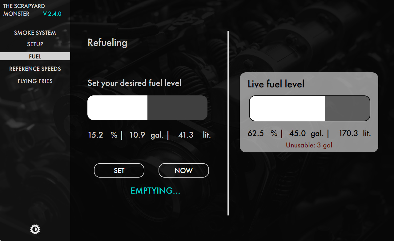
Each of my EFBs is a snapshot of what I knew how to do with MSFS HTML gauges at the time I built it. The oldest ones are simple, a little rigid, and honest about it. Then came the Quasar, at the end of 2025, and with it a huge jump in interactivity and features. A large part of that jump I owe to Pseud, who brought a level of technical skill to the studio that I simply did not have, and who opened my eyes to what these little screens could really do.
Then came my active collaboration with Claude Code, Anthropic's AI coding assistant. It helped me go much deeper into how Coherent, the HTML engine that runs inside the simulator, actually behaves, and it made it far easier to turn what I had in mind into something that works in the cockpit.
The result of all this was a fleet moving at several speeds. Every new aircraft was better than the previous one, but the older ones stayed where they were unless I was working on a major update. But even then, I didn't have a real standard to follow.
It started with a checklist
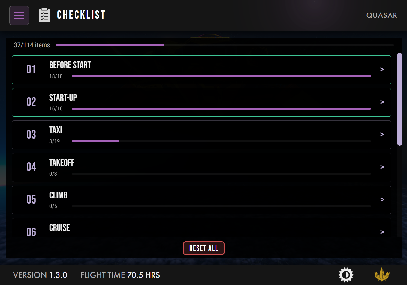
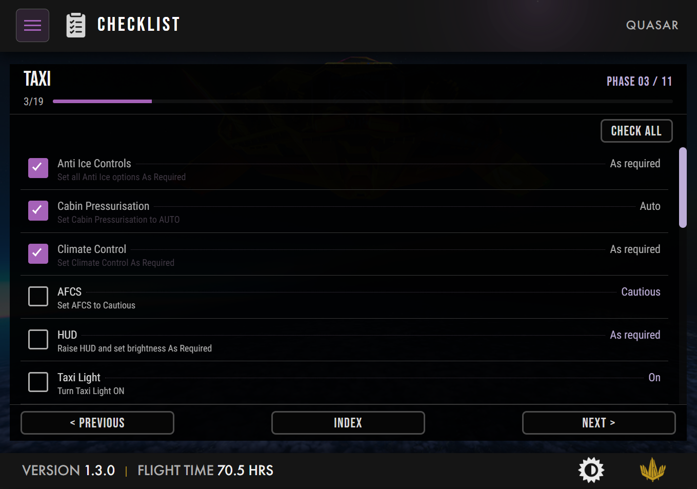
The trigger was not grand at all. I wanted two things on every aircraft: the interactive checklists, the very same ones we publish on the Flying Fries website, and the studio news, so that the tablet in your cockpit could tell you what is happening at Flying Fries.
While I was at it, I looked at two pages I had been adding more or less everywhere over the years: Info, with its QR codes pointing to the manual and other resources, and Speeds, with the reference speeds of the aircraft. They existed on most aircraft, but each one had been built in its own way. Very close to each other, but different enough that it never felt like a unified experience. It was time to fix this.
The snowball
Then the list started to grow on its own.
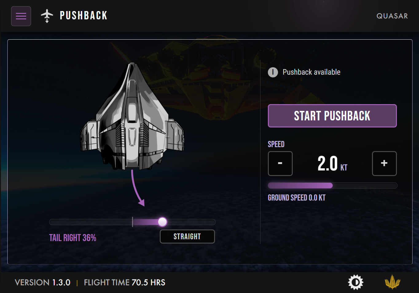
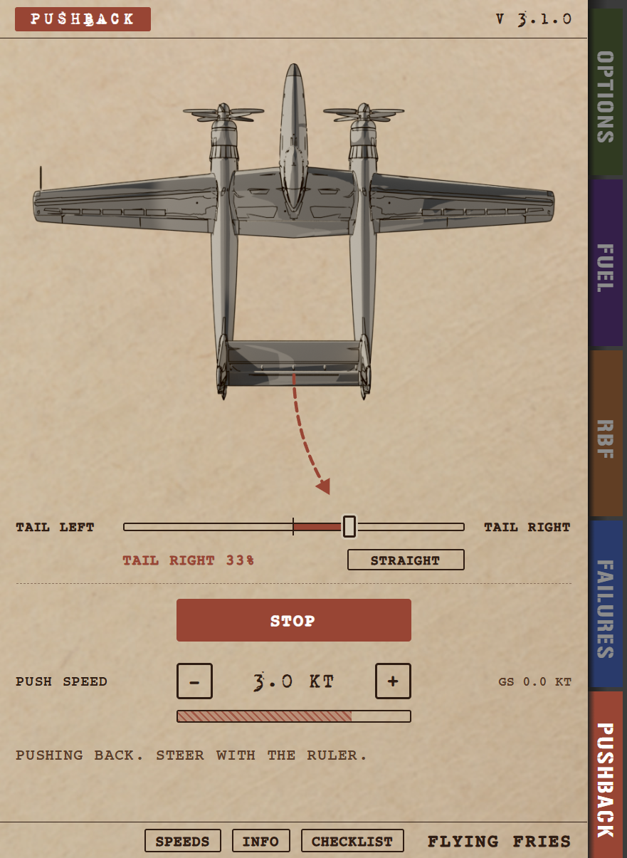
The first addition was the pushback. None of my aircraft had a real one. The Gabriel had something, but let's be honest, it was very limited and very handcrafted. What we built this time is a fully custom pushback in which you can steer and change the speed of the pushback. Yeah, I know, it's fantastic, right? Each aircraft has its own top-down view, but the gestures and logic are exactly the same on every aircraft. Learn it once, use it everywhere.
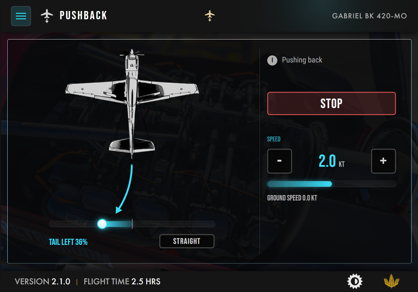
Then I realized that the Options page could also be organized in a smarter way, with settings grouped by theme, so that it could exist on every aircraft without feeling forced. And then, page after page, almost everything turned out to be something we could share. Fuel. Remove Before Flight. Pilot selection.
At that point, we were no longer talking about a few common pages. We were talking about a real standardization of the user interface, the user experience, and even the icons.
A color has to mean something
Standardizing a layout is easy. Standardizing the meaning of what you see is where the real design work begins.
We settled on a simple rule: on a Flying Fries EFB, a color never decorates, it always says something. There are only three of them.
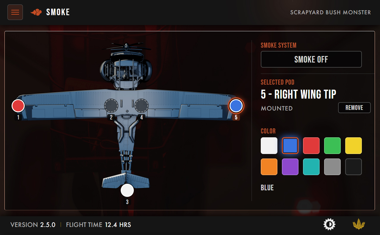
- The accent color of the aircraft is used for everything you interact with and everything that belongs to that aircraft: the page you are on, the sliders you drag, the values of your options, the pages that only exist on that aircraft. Purple on the Quasar, cyan on the Gabriel, orange on the Monster.
- The Flying Fries gold is the voice of the studio: the logo, the section titles.
- A neutral light gray is for the content itself.
Everything else is shared. Change aircraft, and only the accent changes. That is what makes three different tablets feel like one family.
The icons follow the same logic. There is now a single icon library for the whole fleet, one concept, one icon. The pushback has the same icon on every aircraft, and so does the checklist, and so will anything we add in the future.
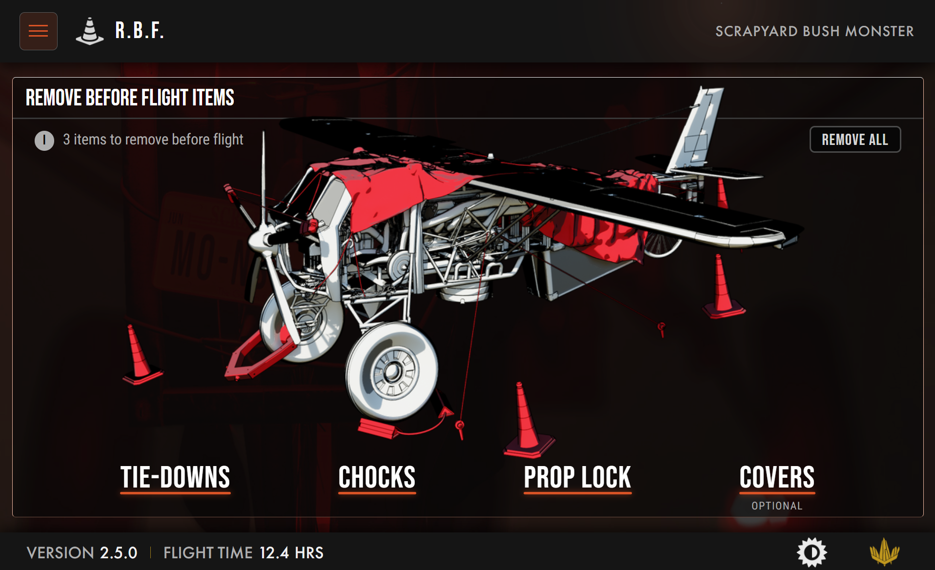
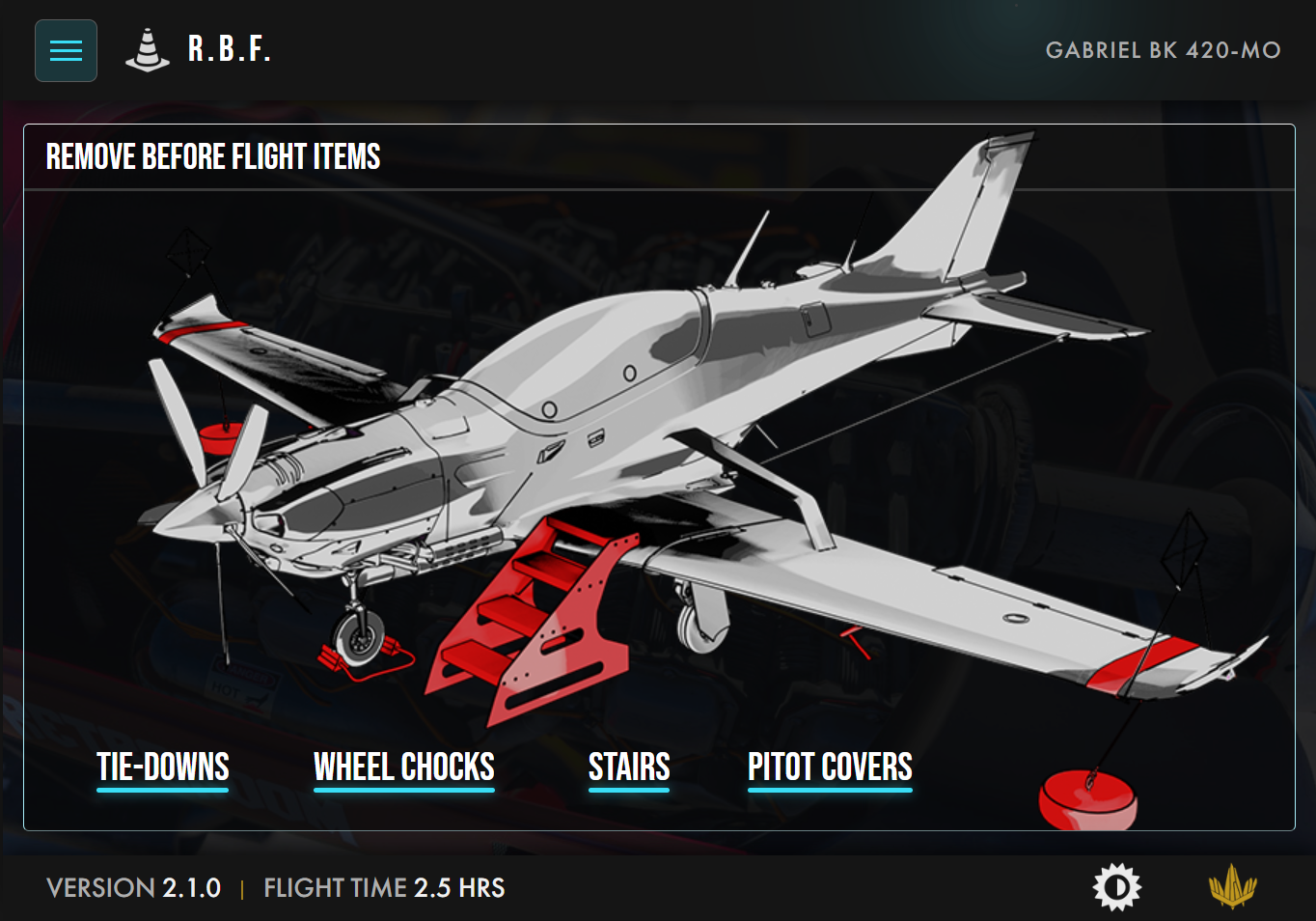
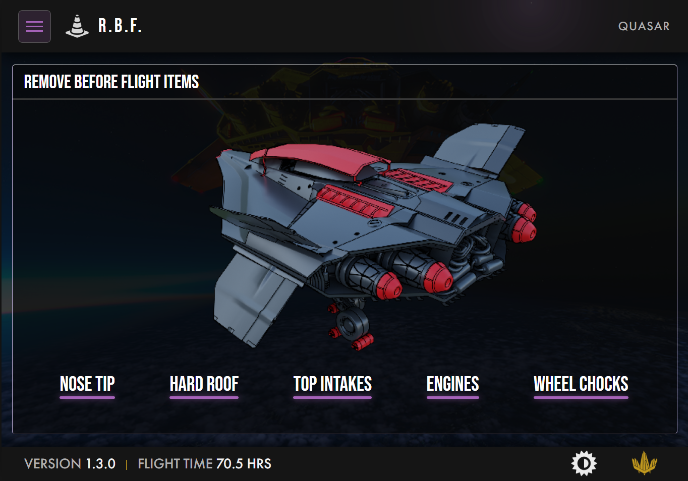
"Okay, we have our standard." Almost.
This is the part of the story I find the most interesting.
After a few days of work, I was genuinely happy with the result. Everything was consistent, the colors made sense, the pages were shared. I was about to write "done" and move on.
Instead, I let it rest for a day or two. And when I came back to it with fresh eyes, I saw what I would have accepted out of fatigue. The EFB had two navigation bars: one at the top of the screen and one at the bottom. Two places to look. If you wanted to go from Options to Pushback, and then to the Speeds, you never quite knew where to click.
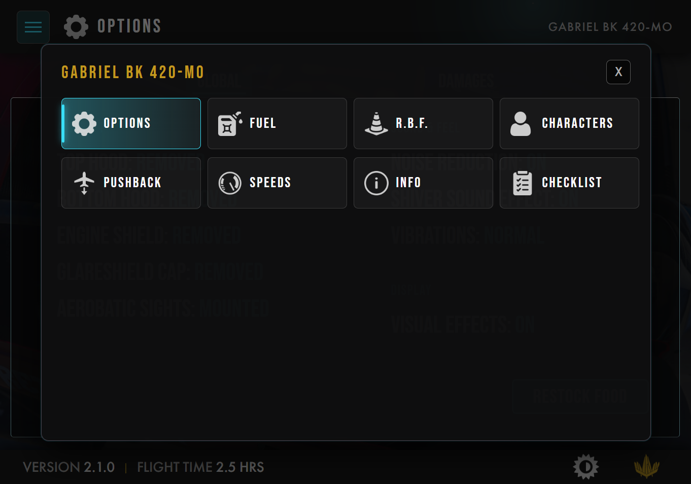
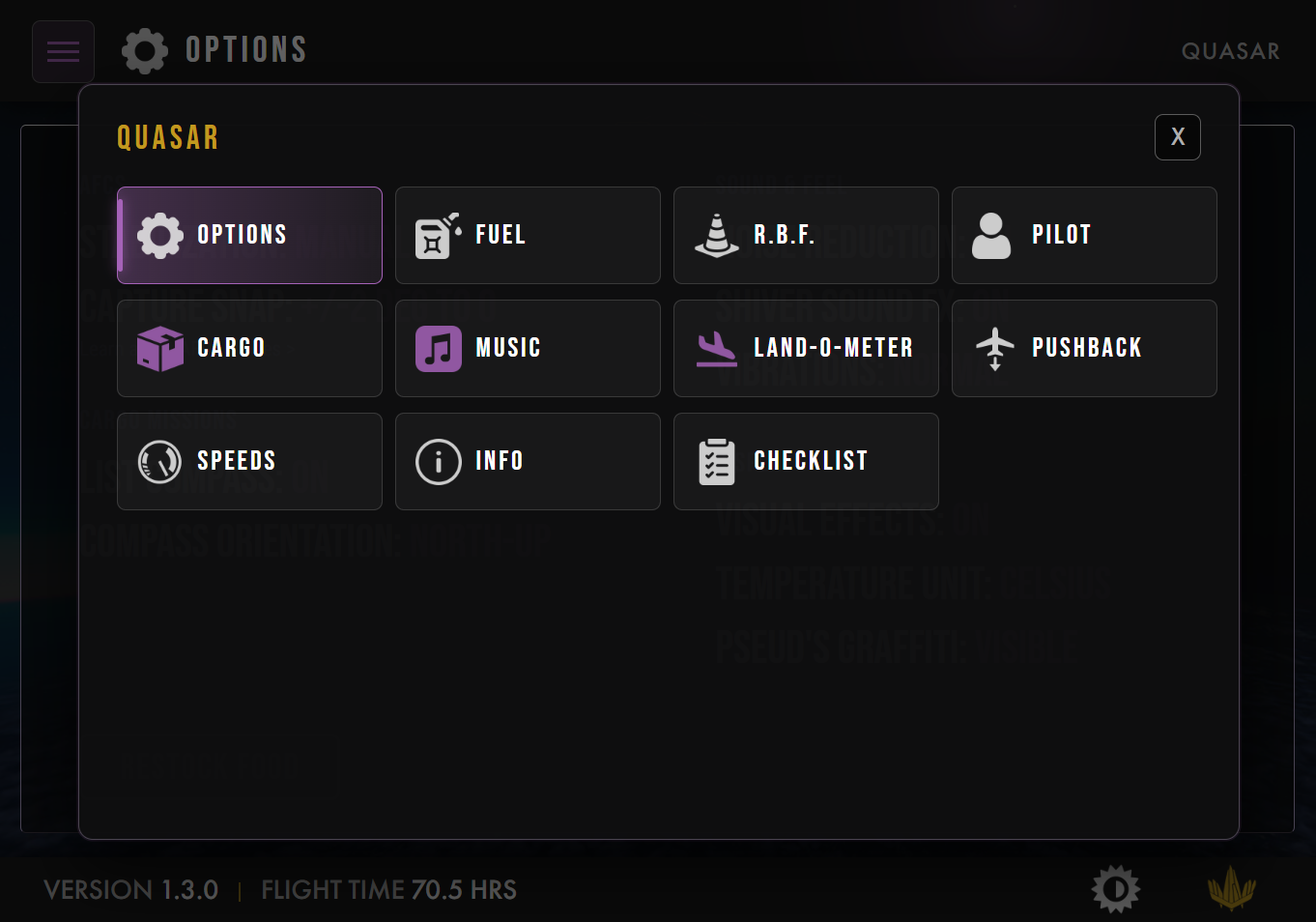
So we reopened the design work, properly this time. A vertical sidebar was considered and dropped: on a landscape tablet, width is precious, and long page names would have made it even wider. What we ended up with is a single menu that opens as a pop-up over the screen, with every page laid out as a tile.
And the first row of that menu is always the same, on every aircraft: Options, Fuel, R.B.F., Pilot. Then come the pages that belong to that aircraft, in its accent color, and then the pages every aircraft shares. After a few flights, you recognize the shape of the menu before you even read it.
What is running right now?
Questioning the menu did something I did not expect. It freed up screen space for the feature that I think brings the most value to your actual flying.
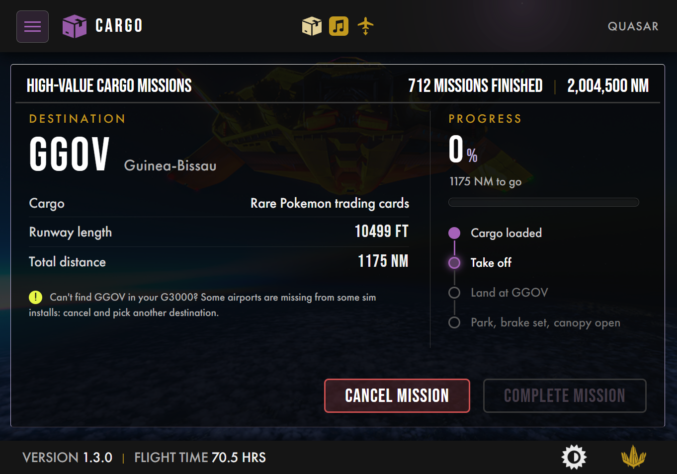
Picture this: you start some music on the Quasar, then go to the Fuel page, then to the pushback. The music is still playing, but nothing on the screen tells you so anymore. To stop it, you have to remember where it lives.
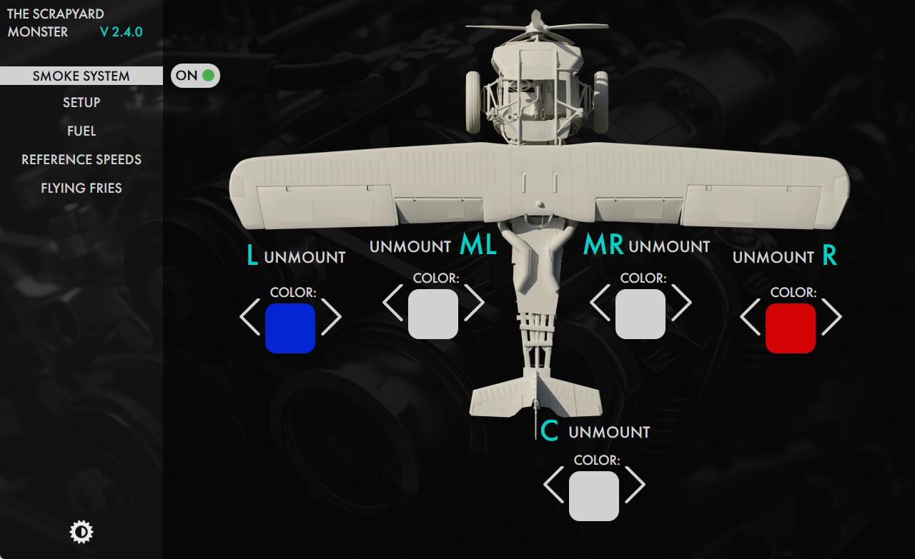
Now, whenever something is running on a page (music playing, a cargo mission in progress, a pushback underway, smoke turned on), its icon appears in gold at the top of the screen. One click on it, and you are back on that page, wherever you were. It is the same idea as the icons of running apps on your phone or your computer. And that is exactly the level of ergonomics you expect from a tablet: something that behaves like an operating system, not like a series of static pages.
Shared pages, and pages that earn their place
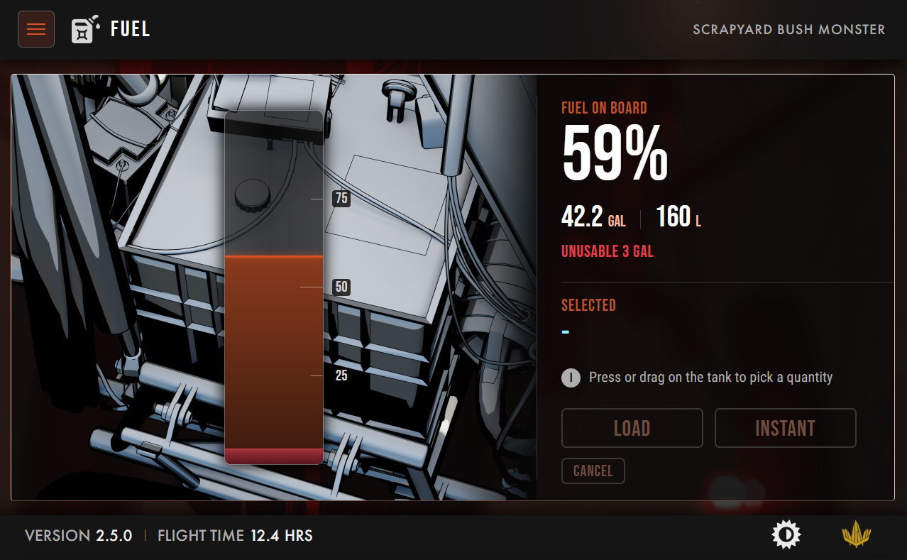
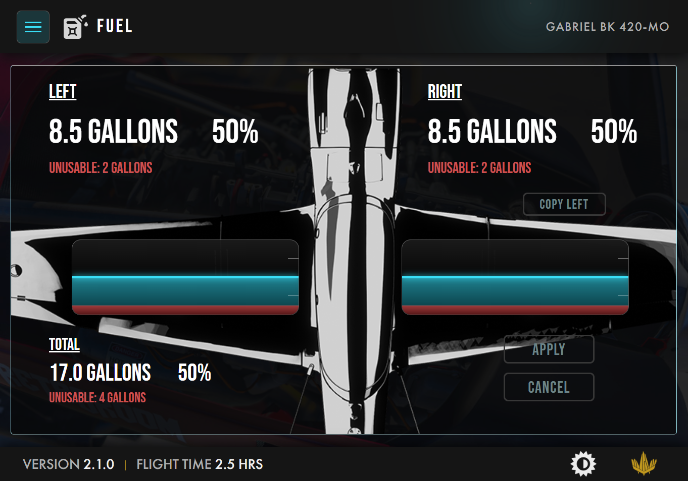
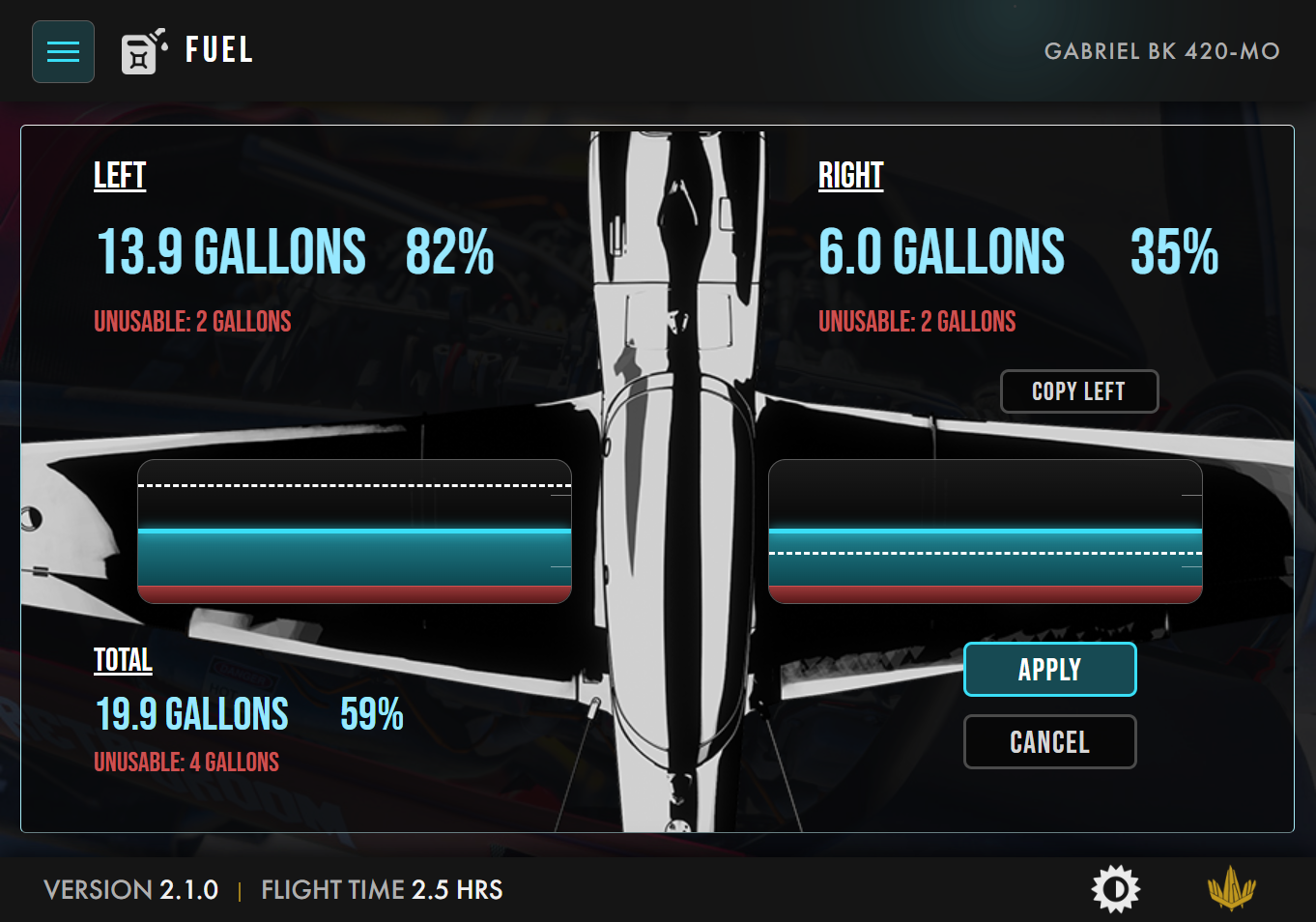
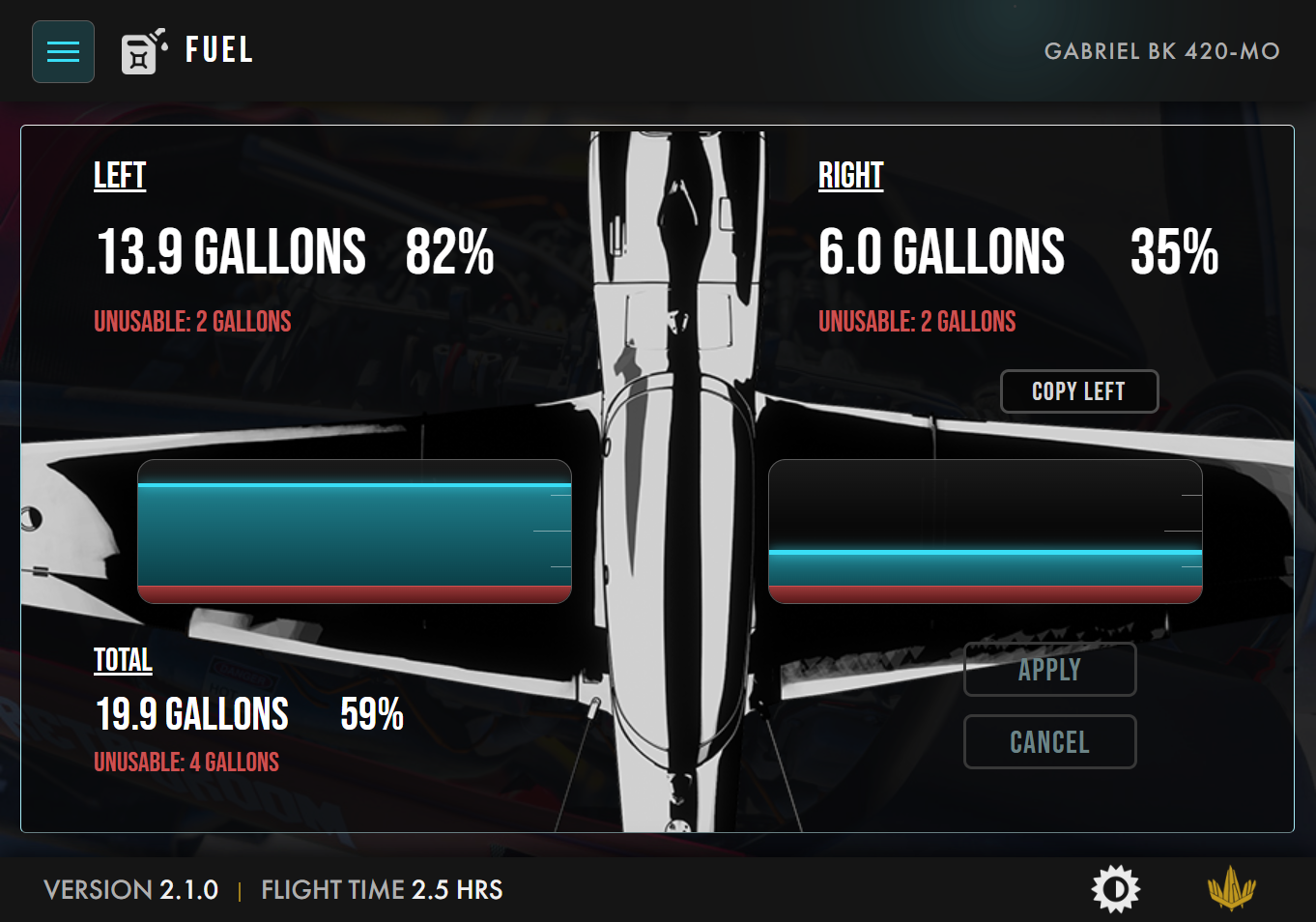
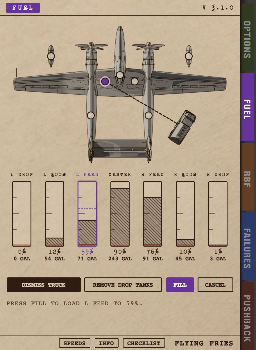
Beyond the navigation, the shared pages got their share of attention too. My favorite is probably the new Fuel page: every tank is a glass gauge, and you set the quantity directly inside it. Tap at the level you want, drag to fine-tune, and confirm. No separate slider, no extra step. It is both faster and far more precise than before.
But a standard does not mean every aircraft gets every page. Some pages exist because an aircraft offers a very specific challenge, and they stay with that aircraft.
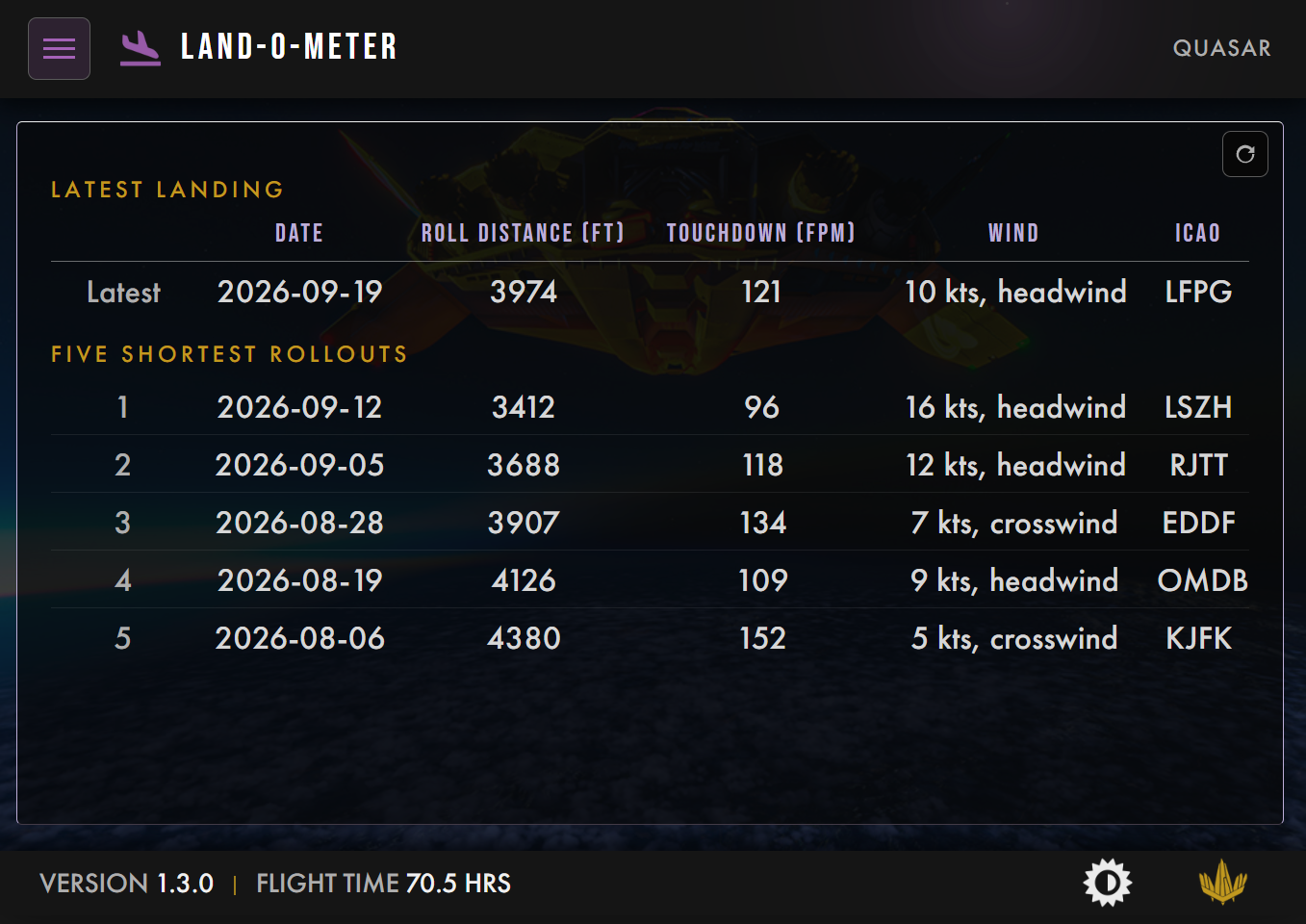
The Land-O-Meter stays on the Quasar only. Putting down an aircraft that heavy and that powerful on the shortest possible distance is a real challenge, and it deserves a scoreboard. It now keeps your last landing and your five best, and if you tie a record, the old one stays in front. Matching is not beating.
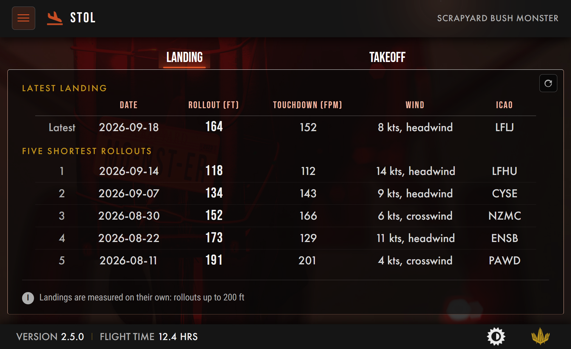
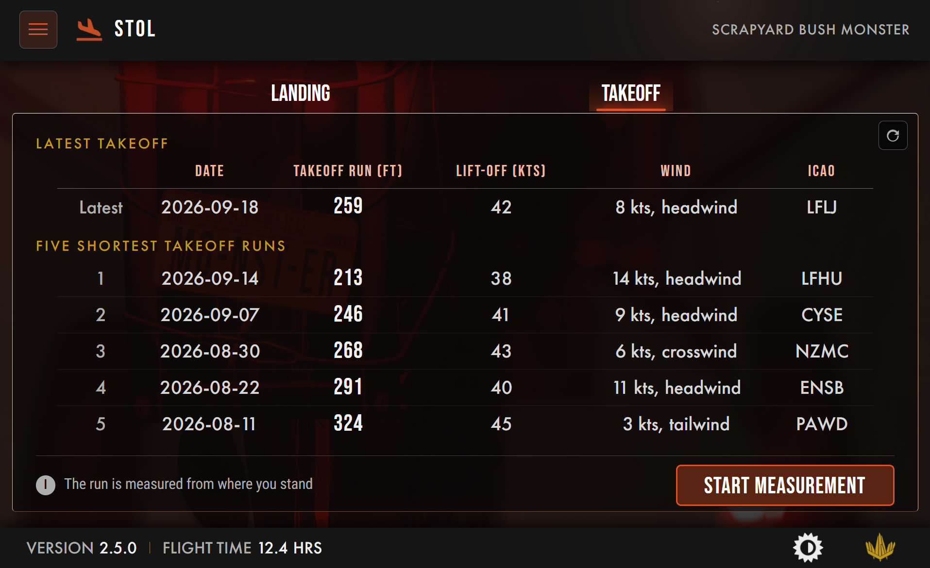
The Monster, on the other hand, will get a STOL-meter, recording your shortest takeoffs and your shortest landings. Not because it is hard, but because the Monster can go ridiculously short, and you deserve to know exactly how short.
And the XF-11?
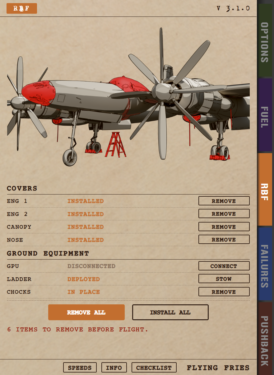
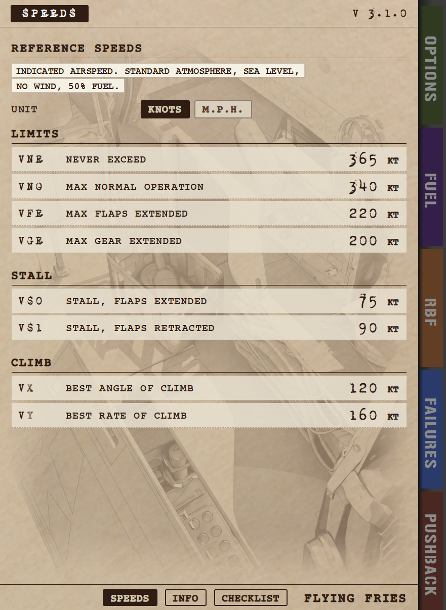
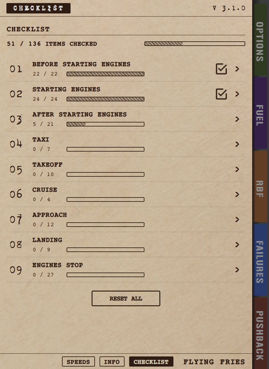
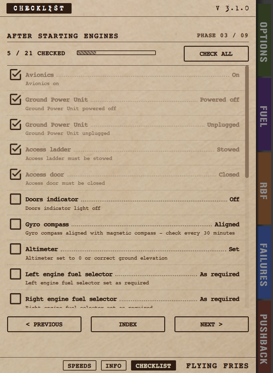
The XF-11 does not have a tablet. It has a paper clipboard, in portrait format, which fits its era and its personality far better than any screen would. The standard does not apply to it pixel for pixel, and it was never meant to.
But the same features are all there. A dedicated pushback page. A refueling page that is much more precise and relevant than before. The checklists. The studio news. Different form, same intentions. And to me, that is the best proof that this standard is about what things mean, not about what they look like.
When?
The new EFB will roll out aircraft by aircraft over the coming weeks:
- Quasar: next week. It is the first aircraft to receive the new EFB, along with many other gauges redesigns and fixes to its HUD and its AFCS.
- Gabriel: a few days later, still in September, with a handful of small fixes to its instruments and systems.
- Scrapyard Monster: in October, with performance improvements and fixes to some of its other HTML gauges.
- XF-11: in October as well, with additions to its sound pack.
As you can see, none of these updates is only about the EFB. As fantastic as it is, I am not going to ship a patch just for a tablet.
One language
For years, my aircraft were like siblings raised in different houses: clearly from the same family, but each with its own habits. From now on, they all speak the same language. You will open the menu in the same place, find your fuel in the same place, and push back with the same gestures, whether you are about to fly a hypersonic prototype, a modern Italian trainer, a forgotten legend from 1946, or a bush plane that looks like it came straight out of a scrapyard.
And whatever comes next will simply follow the same path.